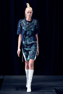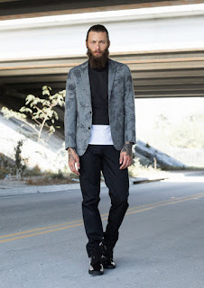
In late April this blog introduced you to the color prognosticators at Pantone.
As a refresher here is some of what we learned about Pantone, Inc. and their process.
Pantone, Inc. is a company that is headquartered in New Jersey - known for Pantone matching system
(PMS) which is a proprietary color system used by various industries such as:
- Printing
- The manufacture of colored paint
- Fabric and Plastics
- Fashion
- Interior Design
- Floral Design
Pantone has become one of the most influential forecasters of colors for all of these industries for each upcoming year.
Twice a year the company hosts a meeting of color "experts" from around the world. At these meetings the group discusses and presents various colors they are predicting to be important in the coming year. Much attention is paid to reflecting the "spirit of the time and culture".
According to Wikepedia, "The results of the meeting are published in Pantont View ($750), which fashion designers, florists, and many other consumer-oriented companies purchase to help guide their designs and planning for future products." Pantone's "color of the year" concept is the vision of Leatrice Eiseman, Executive Diretor of the Pantone Color Institute.
So just what is the Pantone color landscape for Fall 2015 all about?
"Juxtaposition of color from opposite sides of the spectrum emphasizes poise and confidence on the runway. The Fall 2105 palette is roote in multi-faceted, androgynous colors that can be worn to portray endless sophistication across mens's and women's fashion; it is the first time we are seeing a truly unisex color palette."
Leatrice Eiseman
Executive Director, Pantone Color Institute
As we take a look at some of the specifics of this great color landscape remember it's not the clever new names that are important. What we hope is that you will find this information inspiring and fun as we did. Here are some of the ideas we found most fascinating when we reviewed the designer's collections for Fall 2015
- Does the designer's choice of fabric and shape make clear the point of view?
- Does the designer give a point of view by their specific color selections?
- Do the designs and color choices evoke another time and era in fashion?
- How do the designs and new color palette affect my shop and color choices?
In the images we are sharing you will see many different hues and color intensities within the same color story. This is one of the ways for you to actually see the voice of a specific designer or firm.
These first two images are great examples of color being used as you would expect -- olive greens that say casual, rugged, outdoorsy, and military. A good looking menswear outfit with the interest and freshness provided by layering, use of colors, and patterns. In the Gucci military style coat the addition of fur at the cuff makes this more traditional silhouette new.
 |
| Antonio Marras Fall 2015 |
 |
Gucci Fall Winter 2015
|
Dried Herb - Olive Green isn't just Safari and Military anymore in Fall 2015 Dried Herb is more sophisticated and chic, a color that reflects nature's earthy fragrances. Mixes beautifully with Desert Sage, the newestneutral, a cool soothing greenish grey.
Olive green for an evening gown, what do you think?
Here is what we think -
This
is such a great example of using color in an unexpected way. What we
expect is olive green in casual, outdoorsy, military, or safari looks,
right (?), it's often referred to as Olive Drab after all. But,this
Chanel look is such a wonderful surprise, with the model styled in a
feminine whimsical look from head to toe, the gown has a very girly
girl silhouette but it looks wonderful in this rich unexpected color.
And, we LOVE it!
Here's what we think -
This is such a great example of using color in an unexpected way. What we
expect is olive green in casual, outdoorsy, military, or safari looks,
right (?), it's often referred to as Olive Drab after all. But,this
Chanel look is such a wonderful surprise, with the model styled in a
feminine whimsical look from head to toe, the gown has a very girly
girl silhouette but it looks wonderful in this rich unexpected color.
And, we LOVE it!
 |
J.W. Anderson Fall 2015
|
 |
Antonio Marras Fall 2015
|
 |
Anna Sui Fall 2015
|
 |
| Alice + Olivia Fall 2015 |
 |
| Alice + Olivia Fall 2015 |
 |
Anna Sui Fall 2015
|
 |
Tom Ford Fall 2015
|
 |
Charlotte Ronson Fall 2015
|
 |
| Marc Jacobs Fall 2015 |
 |
Dennis Basso Fall 2015
|
Stormy Weather this is a powerful blue grey - think of the sky on an overcast day; it's strong, protective, and enduring. This fall Stormy Weather implies luxury and quality. Deep strong blue
is not just for the boardroom any more, for both men and women!
 |
| Tomas Maier Milan Fall 2015 |
 |
| Cynthia Rowley Fall 2015 |
 |
| Alice + Olivia Fall 2015 |
 |
| David Hart Fall Winter 2015 |
 |
Carolina Herrera Fall 2015
|
 |
| Notte by Marchesa Fall 2015 |
 |
| Hermes Fall 2015 |
Fabrice Tardieu Fall 2015
 |
DKNY Fall 2015
|
The other blue stories are Biscay Bay which is a rich cool teal that works beautifully with the other blues and the warmer side of the color spectrum too; while the more "serious side" of blue is seen in Reflecting Pond, a deep cool blue that represents the times we are contemplative and thoughtful.
 |
| Christian Siriano Autumn 2015 |
 |
Christian Siriano Autumn Winter 2015
|
 |
| Carlos Campos Fall 2015 |
 |
| DKNY Fall 2015 |
 |
Cedric Charlier Fall 2015
|
 |
| Marc Jacobs Fall 2015 |
|
|
Barbara Bui Fall 2015
Charlotte Ronson Fall 2015
|
 |
| Marc Jacobs Fall 2015 |
|
|
 |
Chanel Couture Fall 2015
|
 |
Carlos Campos Fall 2015
|
Oak Bluff is warming, comforting, and mellow this is a cozy hue that will nurture and comfort you! But, this great neutral is not just about comfort. Look for it to be fresh, sophisticated and sexy too. As the "work horse" neutral, Oak Bluff pairs beautifully with the entire color landscape this fall.
 |
Nicole Miller Fall 2015
|
 |
| Ovadia & Sons Fall 2015 |
 |
| Anna Sui Fall 2015 |
 |
Alexander McQueen Fall 2015
|
 |
| A.W.A.K.E. Fall 2015 |
 |
| Chanel Couture Fall 2015 |
And, gorgeous together is the sophisticated pairing of Oak Bluff and Marsala.
 |
| Alice + Olivia Fall 2015 |
 |
Yoana Baraschi
|
 |
Ann Sui Fall 2015
|
 |
Marc Jacobs Fall 2015
|
 |
Bibhu Mohapatra Fall 2015
Marsala is a lovely winey red-brown that is rich and full-bodied. The red-brown roots keep this color grounded and important to the entire landscape. We think you can see why Marsala is Pantones "Color of the Year" for 2015.
 |
| Dolce & Gabbana Fall 2015 |
 |
Givenchy Fall 2015
|
 |
| Givenchy Fall 2015 |
 |
| Andrew Gn Fall 2015 |
 |
| Andrew Gn Fall 2015 |
 |
| Andrew Gn |
 |
Rebecca Minkoff Fall 2015
 |
Haute Hippie Fall 2015
|
|
 |
| Marni Fall 2015 |
 |
Chanel Couture Fall 2015
 |
Antonio Marras Fall 2015
|
 |
Antonio Marras Fall 2015
 |
Marc Jacobs Fall 2015
 |
Just Cavalli Milan Fall 2015
|
 |
 |
Balmain Fall 2015
|
|
 |
David Hart Fall Winter 2015
 |
David Hart Fall Winter 2015
|
|
|
 |
Angelas Bratis Fall 2015
|
 |
A.W.A.K.E. Fall 2015
|
This color pallet's homage to the 60's 70's is the delightful Cadmium Orange,
and it's all about fun and fantasy. It's a spark of energy and
excitement. When used with the rest of the pallet, Cadmium Orange
enlivens the entire landscape.
|
|
|
 |
Antonio Marras Fall 2015
|
 |
Marc Jacobs Fall 2015
|
 |
| Marc Jacobs Fall 2015 |
 |
Acne Studios Fall 2015
|
 |
| Acne Studios Fall 2015 |
 |
J.W. Anderson Fall 2015
|
 |
Moschino Fall 2015
|
 |
Camilla and Marc Fall 2015
|
 |
Dior Fall 2015
|
Cashmere Rose, too is a nod to the 1960s. This time it's a cultured, rich, and sometimes a gentle pink. Think more "uptown than downtown". It can go from pale to bold and it looks great with many of the other landscape colors stories. Look at the dramatically different feelings being expressed in the designs below using Cashmere Rose.
 |
| Alexander McQueen Fall 2015 |
 |
| Alexander McQueen Fall 2015 |
 |
Notte by Marchesa Fall 2015
|
 |
Acne Studios Fall 2015
|
 |
Banana Republic Fall 2015
|
 |
| Chanel Couture Fall 2015 |
 |
| Gucci Fall 2015 |
 |
| Gucci Fall 2015 |
 |
| Marc Jacobs Fall 2015 |
 |
| Marc Jacobs Fall 2015 |
Audra Fall 2015
 |
| Todashi Shoji Fall 2015 |
 |
| Todashi Shoji Fall 2015 |
 |
| Chanel Couture Fall 2015 |
 |
Chanel Couture Fall 2015 |
 |
| J.W. Anderson Fall 2015 |
 |
| Dolce & Gabbana Fall 2015 |
 |
| Dolce & Gabbana Fall 2015 |
 |
| Clover Canyon Fall 2015 |
 |
| Clover Canyon Fall 2015 |
 |
Ashely Williams 2015
|
 |
Bouchra Jarrar Fall 2015
|
 |
| Central Saint Martins Fall 2015 |
 |
Central Saint Martins Fall 2015
|
 |
Junya Wantanabe Fall 2015
<
|
Amethyst Orchid holds a uniquely bold and creative position in this color landscape, and it is what Pantone refers to as the "Jewel in the Crown". This is where you can see elegance, boldness and tradition collide in a most beautiful way.
 |
| Marchesa Fall 2015 |
 |
Marchesa Fall 2015
|
 |
| Chanel Couture Fall 2015 |
 |
| Chanel Couture Falll 2015 |
 |
Anna Sui Fall 2015
|
 |
Anna Sui Fall 2015
|
 |
| J.W. Anderson Fall 2015 |
 |
Maison Martin Margiela
|
 |
| Erdem Fall 2015 |
 |
Erdem Fall 2015
|
 |
| David Tlale Fall 2015 |
 |
| Cynthia Rowley Fall 2015 |
 |
| Cynthia Rowley Fall 2015 |
 |
| Todashi Shoji Fall 2015 |
 |
| Todashi Shoji Fall 2015 |
 |
| Barbara Tfank 2015 |
 |
| Barbara Tfank |
 |
Junya Watanabe Fall 2015
|
Sources:
Pantone.com
milandesignagenda.com
Style.com
Vogue.com
Wikipedia.com
Designer's websites
 |
Tom Ford Fall 2015
|
 |
Bibhu Mohapatra Fall 2015
|
 |
J.W. Anderson Fall2015
|


No comments :
Post a Comment